Calm Colors for a Peaceful Living Room: 6 Palettes That Always Work

Color affects how a room feels long before you notice the furniture. The goal of a calm palette isn’t “boring neutrals”—it’s low contrast, warm undertones, and a few natural accents that let your eyes rest.
The rule that makes any palette feel calmer
Keep contrast gentle:
- Walls: soft and light
- Big furniture: medium tones
- Small accents: muted (not neon)
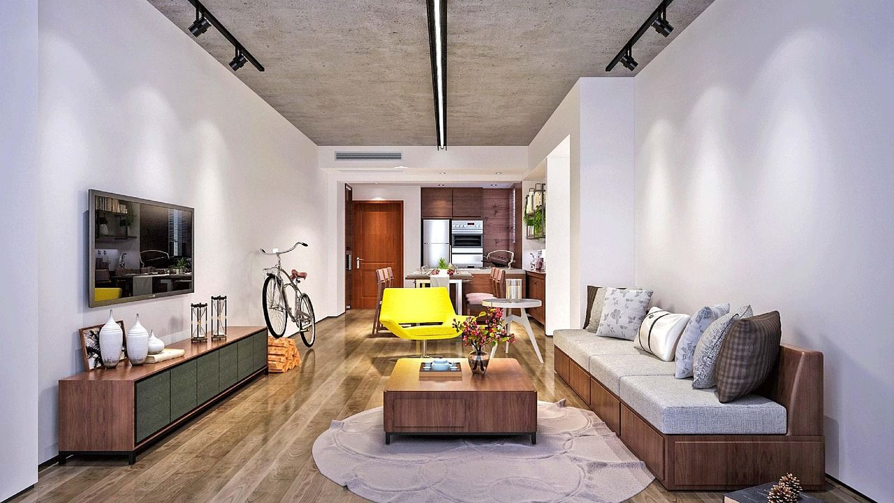
6 calming color palettes (easy to copy)
- Warm white + light oak + sand
Clean, airy, and cozy (great for small living rooms). - Greige + soft black accents + natural linen
A modern, quiet look—works well with minimal styling. - Sage green + warm white + wood tones
Calm and nature-inspired, especially nice with plants. - Dusty blue + cream + pale wood
Relaxing without feeling cold (choose dusty, not bright blue). - Clay/terracotta + beige + walnut
Grounding and warm—best as accents (pillows, art) instead of full walls. - Mushroom/taupe + off-white + soft olive accents
Very “calm hotel” vibe, easy to keep timeless.
Make it healthier (and more genuinely “wellness”)
If you’re repainting or refinishing, consider low-odor, low-VOC options—non-toxic finishes are increasingly part of what people look for in eco-friendly home choices.
Quick way to choose the right calm color
Paint swatches lie in store lighting. Test at home:
- Put 2-3 sample swatches on the wall (not just one).
- Look morning / afternoon / night.
- Choose the one that stays soft in all lights (not the one that looks “most exciting” at noon).


